Back to School For Execs - Part 3
- James Harper
- Dec 2, 2019
- 7 min read
Updated: Dec 3, 2019

Data Source and Quality.
The first step in evaluating an analysis or report should be to understand where the underlying data has come from. In the majority of business scenarios the data will be coming from internal systems, although this may not always be the case. If it is not clear from the report presented, then you should always ask the analyst who has developed the report to clarify. You must validate that the source of the data reliable, unbiased and trustworthy before proceeding.
Once the source of the data is verified, you must also consider the quality of the data. Was the data complete or was there missing data? If there was missing or poor quality data, how were each of these issues handled. For example, if I have customer data that includes both suburb and postcode, but some of the postcodes are missing, it would be reasonable for the analyst to infer the missing postcodes. However, at times, possibly the suburb is also missing and it might not be possible to infer the correct value. In such cases the analyst may opt to remove the row of data from the analysis, again this can also be valid. In these situations we would want to know how much of the dataset was impacted by poor data quality, how they were categorised, and the percentage that needed to be removed.
At times it might not be so clear that a data quality issue is present. For example, if I am looking at the headcount of departments within my company, a good check of the data would be to compare this month to the previous month headcount for each department. If there is a large discrepancy it would be expected that the analyst confirm that the data is correct. If there is a significant change this would be a flag that would warrant further investigation. Remember that just because there is a difference it may not always be an issue. The change in team size may be because a project was completed or a team may have been moved but sometimes it may be an error.
As an executive you must be confident that the source of the data is reliable and the quality of the data is appropriate to make business decisions on.
Impact of Outlier
Outliers are data points that are correct in that they really did occur and are not an error in the data, but are outside the norm. In some cases it is important to keep outliers in an analysis, and in other cases it is important to remove them as they will skew the results inappropriately.
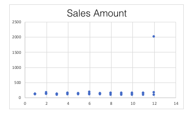
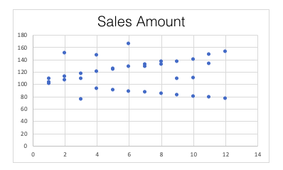
In the example below there are sales transactions for each month in a year. All of the individual transactions are within the range of $75-$165, with a single transaction in December of $2,000. In this example we know that the $2,000 transaction was fantastic, but it was a once off whale of a sale. It may occur, but very rarely, say only once every few years.

In this example the average (mean) sale amount is $166.67, which is interesting because excluding the one very large transaction in December, all other transaction amounts are less than the average. Imagine being the salesperson receiving feedback that you are underperforming because your transaction total is low because it is under the average of $166.67. Also consider the total sales for the year. In this example the annual sales total is $6,000. Again, just looking at the total amount a CFO may expect the sales team to be able to increase their sales next year, say maybe by 15%, and set a target of $6,900.

However, excluding the one large December transaction (as shown above), the annual sales total is just $4,000. We know that the “whale of a sale” is unlikely to happen again next year. A more accurate forecast for next year’s sales total will be closer to the $4,600-$5,000 range. In this simple example we can see how a single outlier can significantly impact the analysis.
Outliers should not always be excluded, there are times when outliers are completely valid. In the example above, it could be equally valid that the $2,000 December transaction may be a seasonal one, for example, it might be a transaction that occurs due to Christmas sales. In this case it would be important to include the outlier in the analysis. The key learning with outliers is to ensure that their presence is known and that a conscious decision to include or exclude is made based on knowledge of the data and most importantly the business.
Assessing Change
As an executive, our focus is often on changes that are occuring in the reporting period. How is the business performing month to month? How is customer satisfaction changing? How is disability representation in our workforce changing year to year?
Consider being an executive working in an organisation that is actively trying to increase customer retention. Now imagine being presented with a report showing a decrease of 20% in customers. I’m sure that would be very disappointing and you would be keen to take some definitive action to stop this decline, because 20% is a massive decline. Well 20% is a massive change in many cases, huge, but not when this particular portfolio of clients has just five customers. In this case a 20% change is a loss of just one customer. So while definitely concerning, it’s a very different scenario to the one we initially thought we were facing.
At the other end of the scale is a large European oil extraction and refining organisation that has an organisational KPI to drive an increase of just 1% in revenue. In the case of this organisation, their annual revenue is in excess of US$1B, so this 1% will equate to around US$10M. So while the 1% sounds easy to achieve, increasing profit by US$10M paints quite a different picture.
The key point is, when the total number is at an extreme (large or small), it may be more appropriate to talk in absolute amounts rather than percentages.
Vanity Metrics
Vanity metrics are metrics that make you look good, but don’t give a complete picture of performance. It’s like self-regulation, and we know how well that works. A classic vanity metric is something like registered users. Think about the value of registered users (vanity metric) compared to active users (actionable metric).
When a performance report is being presented, you should be looking at each of the individual metrics and consider if these metrics actually measure the performance you are interested in? It’s the sniff test of sorts. If performance of a unit is poor and you are being presented with metrics that are positive, then it’s a sure signal that either these are not the right metrics, or there are key metrics missing. Your role as an executive is to evaluate and to ask the question if things are not adding up.
The purpose of metrics is to measure the effectiveness of an action in the business to drive a positive business performance i.e. did the advertising campaign boost sales. If it did, then repeat/expand the campaign, if it didn’t then stop, pivot and try again. If we are looking at a metric that doesn’t measure the effectiveness of a business action, then it really serves no purpose other than giving ourselves a pat on the back. Make sure all metrics being presented are actionable.
Creative Writing
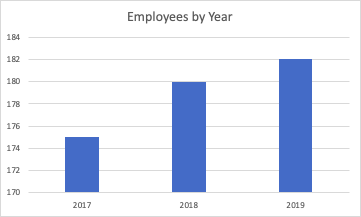
Creative writing of performance metrics is what I like to call situations, where a metric is accurately presented and is an actionable metric, but is presented graphically in a way that exaggerates its performance. Take a look at the chart below. We can see there has been a big increase in employees.

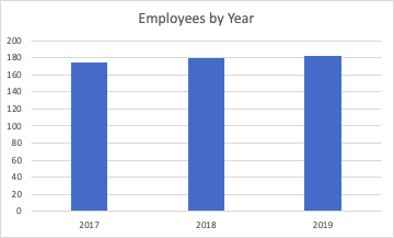
Now let’s compare this to the following chart, which tells a much different story, not much change at all this time.

And this is why I call it creative writing.
Both charts are showing exactly the same information, the only difference is the vertical axis scale. In the first the range is from 170 - 184, where the second goes from 0 - 200. It’s important to check the axis scale, particularly if you are trying to compare across multiple charts. This ensures you understand exactly what you are comparing, rather than just relying on the visual difference which can at times be misleading.
10 “Data” Commandments
Your role as an executive is not to be a pseudo-analyst, but it is to take the time to understand what is being presented. Your real value comes when you apply your business acumen, and to ask questions. Only when you are comfortable with all of the information, you utilise it to make a clear business decision, which will lead the organisation forward. Outlined below are the 10 questions I like to use to develop a good level of understanding and comfort with the analysis being presented to me.
DATA Questions
Where is the data from?
What is the quality of the data like?
If this is a subset of the data, does it accurately represent the whole dataset?
Were there any outliers in the data, have they been included or excluded and is that correct?
Am I comfortable making a financial decision or significant business decision based on this data?
ANALYSIS Questions
Were any assumptions made in the analysis, are each of these assumptions valid?
Are the metrics being displayed the ones that correctly measure the business performance I am investigating? Are there any other metrics that need to be included to complete the picture?
If I am looking at changes, is a % accurate or should I be using the absolute change?
Looking at each individual chart, do I know what it is measuring, what is the axis range, what does it mean, is that what I would expect?
Am I comfortable making a financial decision or significant business decision based on this analysis?
Summary
The Executive series has provided you with the data and visualisation foundations to give you a base level understanding of analytics and reporting. In this final part of the series we have focused on how you as an executive can complete a thorough review of analytical reports. As a senior business leader, the onus is on you to make pragmatic decisions to lead the organisation. In the vast majority of cases the reporting presented will be thorough and accurate, however your experience is critical to probe and ensure that this is the case. On occasion, only due to inexperience, important information may have been overlooked or misunderstood, which could lead to an inappropriate analysis being presented. The 10 Data Commandments should be become your standard approach to ensure that you understand the information being presented, you have confirmed its quality and appropriateness, and that you are comfortable making a business decision from the information presented. Because the buck stops with you….


Comments