
Back to school for execs, data school that is - Part 1
- Jamie Harper

- Oct 5, 2021
- 6 min read

Since the Cambridge Analytica scandal in March 2018, the power of data has become more widely understood, yet the understanding of data still remains a mystery to the majority of people. For many years prior to the scandal, there has been much hype around data driven decision making, supported by investments in developing analyst teams and infrastructure. However, surveys and research consistently shows that data literacy remains low and increasing at a very slow rate, in fact Gartner predicts
“by 2020, 50% of organisations will lack sufficient AI and data literacy skills to achieve business value.”
The issue is that across an organisation there is a wide range of data understanding and comfort with numbers, and that is OK. Diversity across an organisation brings benefits in itself, so the assumption that all employees already have data literacy is unrealistic. What we need is a way to help bring our executives and in fact all employees, to a level that empowers them to leverage the data they have available and enables them to be comfortable in making data driven decisions. In this article I’m going to outline some key concepts that are the basis for building data literacy and giving leaders the confidence to question and understand the data that is being presented to them. In a follow up article I will be digging deeper into reports to highlight common issues with reporting and discussing vanity reporting. So if you are someone looking to understand more about reports and data to improve their data literacy, then this article is for you.
Is this the correct data?
The starting point of analysis is the data and two terms; population and sample, are core elements. In its simplest form, the population means all of the information for example, if I am talking about my workforce, the population would be the entire workforce. If I am talking about cars then I am talking about all the cars in the entire world. Whereas a sample is a subset of the population. A sample is used as it might be impossible to get information from every employee in your workforce, so a smaller subset of your workforce is used. Now that sounds reasonable, but a very important element must be satisfied if we are going to use a sample. That is that the sample is representative of the entire population. For example, let’s assume that I have 100 people in my workforce. There are 50 women and 50 men. If I am going to use a sample of say 20 employees then I would want to ensure that 10 are men and 10 are women so that the sample is representative of my population and any analysis that we undertake can be assumed to be the same for the population. A chart of the gender distribution in the entire workforce and the sample is shown below, note the distribution is the same.

Remember that in this sample gender is just one categorisation, we may also have geographic groupings, role types, age, disability and many others. We will want to consider how the sample has been selected and that it adequately represents the entire population.
Is this the correct value to monitor?
If we cast our minds back to the dim dark days of high school, you might remember the terms Mean and Median. While they are very different things, I have often seen them used interchangeably during executive meetings. The mean is the average of all of the items in the sample. The mean is determined by adding all of the items and then dividing by the number of items. So if I am trying to work out the average age of my staff in the sample below. The average is 36.9 years old.

Mean = (20+23+26+30+30+31+34+44+50+54+64)/11
Mean = 36.9
The median is found by putting all the items in the sample in numerical order and picking the one in the middle. In our sample above the middle employee is Employee 6 and so the median is 31. If the middle is between two numbers the mid point of the two values is the median.
Immediately you can see that the mean and the median are actually quite different numbers. This is because the data that we have is not evenly spread around the mean. You can see that we have some big numbers for employee 10 and 11 and this is pulling the mean to an older aged. This is really easy to see when plot the data on a chart, the tail is out to the right hand side of the chart, we call this a skewed dataset.

It is in cases like this that we need to think about if we should be looking at the mean or the median. In this particular case the median would be a more appropriate measure of our employee age as half of our employees are older and half are younger.
Is this data good enough?
Nearly every dataset that is used to conduct business analysis and reporting will have issues with errors and quality. It is highly unusual that data can be imported and immediately analysed. The first step of a data project is to identify issues with the data. This can be missing information or potential erroneous values. The analyst needs to make decisions on the data, for example if there are some values missing should the row be dropped or can the value be determined or maybe it could be estimated. Each of these options can be valid but understanding the implications of each is critical to ensure the end results will remain valid. Each decision on data cleansing should be recorded and be available for review. As a manager and a consumer of a report it is important to consider the quality of the data and for the analyst to be able to provide details to you to ensure that the analysis and results are valid.
Is this related to that?
We use a scatter plot of two variables to determine if they are related or "correlated". Looking at the scatter plots below we can see the chart on the left there is a clear relationship between the variables where the chart on the right is more random.
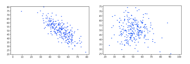
We can calculate a number called the correlation coefficient which is a number from -1 to +1, that is a measure of the strength of the relationship. The closer to 0 the weaker the relationship and the closer to +1 or -1 the stronger the relationship. For example the correlation coefficient of the chart on the left is -0.76 where the correlation coefficient on the right is -0.05.
As an exec you don't need to be able to calculate these but here is a guide for assessing the strength of the relationship:
-1 = a perfect negative (downhill) relationship
-0.7 = a strong negative (downhill) relationship
-0.5 = a moderate negative (downhill) relationship
-0.3 = a weak negative (downhill) relationship
0 = no relationship
0.3 = a weak positive (uphill) relationship
0.5 = a moderate positive (uphill) relationship
0.7 = a strong positive (uphill) relationship
1= a perfect positive (uphill) relationship
One final and very important thing to remember with correlations is that even though there may be a strong correlation, it does not mean that one causes the other, only that they are related.
Is this data comparable?
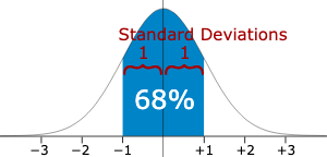
Occasionally you may hear the terms standard deviation or z score and as they are starting to get a bit more complicated they can be used to avoid discussions. In reality they are both a way to tell us about the spread of information. The chart below is what we call the bell curve or a normal distribution. In most analysis we are assuming that we have a normal distribution, the mean (average) value occurs at the centre and the other values are distributed evenly either side of the mean. There are a couple of things to remember about a normal distribution:
68% of values will be located within 1 standard deviation of the mean (shown highlighted in blue below)
95% of values will be located within 2 standard deviations of the mean (the +-2 range in the image below)
So a large standard deviation means the tails on both sides are longer ie the values are widely spread from the mean. A small standard deviation means the tails are very short and the values are clustered more closely to the mean.
The z score can be calculated for each value and it is simply the difference between the value and the mean divided by the standard deviation. It effectively standardises the normal distribution, allowing us to compare values from different normal distributions.
From a managers perspective the z score this ability to compare different datasets is useful. For example which student A or B from two different classes, completing different assessments is the higher performing? Using their z score it is easy to see which has the higher value and is therefore the better performing student.
Summary
Expectations on managers and executives to more to more data driven decision making is reliant on their comfort and ability to interpret and act on the data available to them. To date the training for data literacy has been ineffective at raising the level of competency across organisations. In this first article in this series we have covered the basics for data literacy including populations and samples, means and medians, errors and data quality as well as standard deviation and z scores. In the next article we will work through visualisations that are commonly used in reports and dashboards and a structured approach to understanding the information presented.


Comments